How to Improve Your Mobile UX - 9 Top Tips
Intro
When was the last time you left your house without your cell phone?
Mobile phones have become an indispensable item in everyone's possession. With mobile phones, information has always been at your fingertips, allowing you to communicate with individuals worldwide.
Mobile applications facilitate the acquisition of information and the making of purchase decisions. When it comes to exploring their digital platforms on devices other than desktops, brands have been continually vying to provide the greatest user experience.
In addition, Google has made mobile responsiveness a major ranking criterion in SEO.
So, as a brand, what can you do about it?
Any brand's main goal is to make their products more accessible to their customers, regardless of the technology they use to do it.
9 Simple Tips to Improve Your Mobile UX
1. Ensure The Design Focuses On Accessibility
The first thing to consider and implement in your design, whether it's for an application or a mobile device, is accessibility.
People prefer mobile phones to desktop computers when performing simple research or reading since they are more convenient and simpler. To guarantee accessibility,
- Make sure the CTA is easily visible and accessible. Customers dislike having to look for a call to action.
- Consider straightforward and obvious methods to arrange information and categories for easier reading.
- Keep menus, fonts, and information as basic as possible. Keep in mind that mobile devices have smaller displays.
Here’s an example of a mobile UX with good accessibility:

2. Play With Your Signup Forms Smartly
Sign-up forms that appear the moment you click a web link are spoilers.
Research shows that 86% of people do not like signup forms, and 23% don't convert even after clicking the signup button.
Give your visitors a reason to sign up rather than covering the information on the website even before they go through it.
- Content signup forms are great and have the highest conversion rates as they have a clear goal setting, and the customer knows why they are signing up.
- Tell your visitors why your application or website is important, what it provides, and why they should consider it among the others in the market.
- Keep your sign-up forms simple and crisp. Provide a login option with Facebook, Gmail, etc., to make it easier and quicker.
Here’s a screenshot of a website allowing users to log in using Facebook and Google accounts:

3. Design For The Users
When it comes to user experience, it's always a good idea to think like your consumers. How would you want it to work if you used the app?
This is a question that every designer should consider. Before building a mobile website or application, understand your target audience and demography.
- Think about typography, color palettes, shapes, typefaces, and layouts when developing an application.
- Maintain basic navigation and layout. Younger generations, for example, are more likely to view your website via a mobile phone, therefore including features like responsive visuals and thumb scrolls.
- Use Proto.io or other similar applications to try and test your design before you take it live.
Here’s a screenshot of Proto.io

4. Remember, Less Is More
Reduce the number of extra items on your website. Make sure you just keep what you need while creating a creative web design.
Read: Common Web Design Mistakes that affect SEO
Too many components might cause clutter and prevent visitors from finding the CTA. Visitors are more likely to abandon sites if they do not follow the website's instructions. Bounce rates rise as a result.
- Maintain an appropriate balance of negative and positive space to see and understand all critical elements.
- Use the fascinating copy to encourage your clients and visitors to take action.
- To keep the pages clean and informative, remove excess visual adornment and replace it with simple features and designs.
Here’s a screenshot of a website with a fascinating copy:
5. Make Onboarding Interactive And Easy
The goal of an application is to demonstrate how much more user-friendly the mobile version is than the search engine. You must show how fast and effortlessly users may do tasks while using the program on a mobile phone.
You must guarantee that the mobile design is efficient and simple to use to do this. Customers are more likely to abandon a website if the initial few screens are difficult to investigate and navigate. What you can do about it is:
- You can provide brief instructions on the app's operation in the lesson. Visitors will be able to browse and utilize the app more easily and clearly.
- Keep the signup or account creation process as easy as possible.
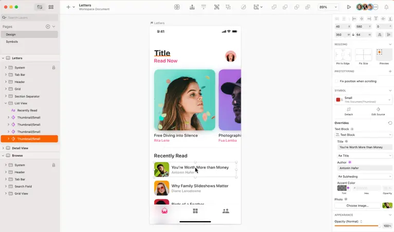
- Use Sketch to create a prototype of how you want the application to be. This will help you work on your designs before you launch them.
Here’s a screenshot of Sketch:

6. Create A Functional And Useful Search Bar
People utilize cell phones to obtain information more quickly. This implies that a mobile phone should include an easily accessible search bar. Its location is determined by the quantity of material displayed on this page.
Customers should be able to see and access it regardless of where it is located. The search bar should also be adaptable and intelligent to grasp the customer's preferences and make appropriate suggestions.
- The search bar should be smart enough to detect misspellings and provide alternate recommendations and hints.
- Allow for filter-based searches, especially for clothes and textiles.
- Create mobile page prototypes using InVision before going live with your pages.
Here’s a screenshot of InVision:

7. Stay Relevant With The Trends
This may appear absurd, yet it is true. Trends are alluring, but they may also be a simple way to commit common UX design mistakes. Although carousels and scroll hijackers are attractive, your offering should not be about looks.
You want to provide them with both functionality and a solution to their problem or response to their question. Trends aren't always required, and focusing on them might detract from the user experience you're after.
- Keep up with industry trends when introducing new features and pieces to your app or website for mobile design.
- Use unique marketing features on a mobile screen or application to differentiate your company from competitors.
- To improve engagement, use gesturization. This adds a touch of class to the application and makes customer and application interaction more accessible.
Chatbots are a popular trend in mobile UX:

8. Personalize Your Pages
If there's one thing to remember while developing sites, keep your end-user in mind.
Create mobile pages that are simple to navigate and explore for the end-user. Use numerous design elements to customize pages wherever feasible.
Provide a more consistent and user-centric experience.
- To assist users in completing activities quickly, limit the number of push messages and enable auto-fill.
- Include a FAQ page to help people comprehend the web pages' simple instructions.
- User input should be limited. Adding card or invoice information is one example. Because mobile screens are usually smaller and zooming in and out might be bothersome, users may become annoyed when entering the information.
Here’s a screenshot of the auto-fill feature:

Read: Top FAQs About Search Engine Optimization
9. Assure Security To Build Trust
After seeing numerous permissions and access requests, users frequently quit particular programs and pages. Limit security access to only what is essential, such as preserving credit card information or enabling access to photo libraries.
Ensure that your permission policies are clear and that your users control how their data is shared within a mobile app.
- Set login limits or auto-logout if your application contains sensitive user information to improve security.
- The padlock sign at the top of the web browser will be recognized and understood by internet users. This indicates that an SSL certificate protects the web page.
- Adding two-factor authentication is another wonderful addition.
Here’s a screenshot of auto-logout:

Mobile UX - FAQs
1. What Is The Essential Component Of Mobile UX Design?
The most critical part of designing for mobile is clarity.
When designing sites for mobile, keep in mind that the user should be able to browse and grasp the page's components with ease. It should be simple to self-guide and go to the CTA. Users have little patience, and intricate designs will simply irritate them.
2. What Is The Most Significant Design Principle For Mobile UX?
The key idea to follow while creating pages is simplicity.
As a designer, you should demonstrate the value of a mobile application or browser above a desktop version to the customer or user.
From the initial screen, try to make the greatest impression possible. Keep the components basic and minimal so that the end-user can follow and comprehend them.
3. What Are The Most Important Aspects Of Mobile User Experience Design?
Font, color, graphics, navigation, CTA positioning, brand design, and language are important considerations for mobile UX design. To develop a user-centric design, it's critical for designers to keep to these criteria.
4. Is Mobile UX Security And Permissions Important?
Yes. You must keep checkpoints at various stages as a designer to ensure optimum security and protection of user data.
For example, it might be as simple as requesting access to the picture collection or activating auto-log off for sensitive websites. This not only protects the consumer or user but also fosters trust. When developing your sites, make sure you have sufficient SSL certification.
Key Takeaways
- Concentrate on application and mobile web page accessibility.
- Keep the menu and search tabs clear and visible.
- To fit mobile screens, use short, crisp copy.
- To make the CTA stand out, use buttons wherever possible.
- Keep the navigation simple.
- Avoid using large font sizes.
- Make your pages as fast as possible.
- Ensure that proper security walls and access are in place.
ABOUT THE AUTHOR:
Brice Decker

Brice has been handling marketing projects for more than 12 years and he is providing consulting services on SEO, Social Media and PPC. He has a huge expertise in working at large corporations including Accenture Interactive & PwC Digital Services.
ABOUT THE AUTHOR:
Brice Decker

Brice has been handling marketing projects for more than 12 years and he is providing consulting services on SEO, Social Media and PPC. He has a huge expertise in working at large corporations including Accenture Interactive & PwC Digital Services.
Related Post
How to Rebrand Your Business Without Losing SEO?