
Get More Conversions with These Landing Page Optimization Tips
Imagine a world where every person who clicks on your landing page converts to a lead.
Now, imagine every lead converting into a paid customer.
Now, stop. Such a thing doesn't exist.
In reality, most landing pages only have an average 9.6% conversion rate. This means only 9 out of 100 visitors would turn into a lead.
But you know what?
Things don't have to be this way. You can improve your conversion rate. It's not that hard. You need to understand a killer landing page's do's and don'ts.
So, let's dive in.
9 Tips to Get More Conversions with These Landing Page Optimization Tips
1. Understand Your Target Market
The biggest reason landing pages fail miserably is that companies have no idea who their audience is. Something that appeals to a 37-year-old mom of 4 children won't appeal to a 27- year- old lady.
That happened when Neil Patel founded Kissmetrics, a web analytics company. They believed every website owner was their target audience and failed miserably.
The company only started growing when it could clearly define its market. Kissmetrics focused more on enterprises and B2B companies than solopreneurs and small businesses. Look at the screenshot below of their landing page that shows what their target audience gets.
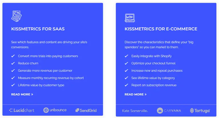
Today, they are among the top web analytics companies. The power of targeting the right audience is indeed big.
Converting a visitor without understanding your target market is like blindly shooting arrows at the aim in the hope that at least one hit the target. You need to understand your target audience in-depth if you want conversions. A few ways to do so are :
- Conduct quizzes, surveys, and interviews. You want to know what their pain point is.
2. Research What's Not Working On Your Page
Several components impact the conversion rate of landing pages. It's easy to get sidelined by unnecessary metrics that don't show the clear picture.
For example, consider that you have quality traffic coming to your landing page and that the offer is the best. But it's still not converting; why?
The key here is to focus on what turned them away from the page, scared them, or annoyed them.
Here's how you can pinpoint this:
- Leverage heatmaps and session recordings tools to capture your users' actions on the page, as shown in the below screenshot. It helps you pinpoint exactly at which point the users went away. E.g., Hotjar, CrazyEgg.

- You can also dig more into website analytics to understand where the traffic is coming from and whether you are targeting the right intent.
3. Highlight The Value Proposition
Let's be honest. Your visitors want something from you; that's why they visit your page, right?
So, you must let the customers know what unique things you will offer them that other brands don't! Your value proposition should help you stand out from your competing brands.
For example, see below a screenshot of buzzsumo’s landing page. Unlike other brands, the‘ start your free trial option allows users to try their tool directly.

Unless they are satisfied with your proposition, they won't convert.
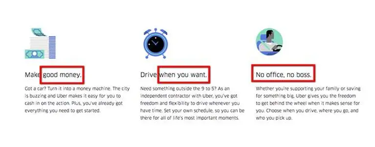
Let's take the example of Uber. They have a unique value proposition that attracts people looking for financial independence. The words "no office, no boss" instantly fulfill one of the users' desires.
4. Isolation & Zeigarnik Effect
Do you know what separates a strong landing page from a weak one?
One word: Isolation.
What does isolation here mean? Why would you want to isolate your users?
Isolation here means not adding any distraction to your page. For example, external links. These links act as distractions that can break your user's focus, meaning fewer conversions.
The method called the Zeigarnik effect is similar to isolation. The effect occurs when you feel disconnected from uncompleted tasks. Such that your brain starts remembering these incomplete tasks better than completed ones.
So when your users have only one task to focus on, they will try to complete it. Thus, improving your conversion. Here's how you can leverage the Zeigarnik effect on your landing page.
- Write open-look headlines or ask open-loop questions. The idea is here to give just enough information to make them interested, but not enough to satisfy their brains. For example, one reason why your landing page does not convert more!
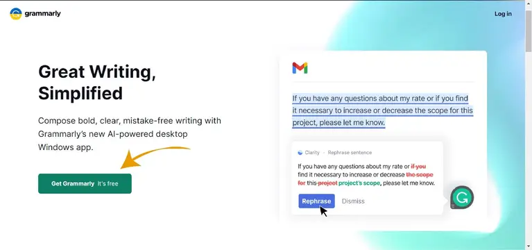
Look at the screenshot below of the Grammarly landing page, which has only one actionable item on the entire page.
- Include the favorite. For example, ten resources to learn investing (Reason #7 is our favorite).
5. Improve Trust With Trust Badges
It's obvious. People want to believe that you are trustworthy when buying from you. That's why you will trust badge standards on most landing pages, especially the e-commerce ones.
But do people check the authenticity of these badges?
The answer is YES. They do. Karsten Lund ran an A/B test for six months, where he added a single trust badge on the header of his e-commerce site. The results? 32% increase in conversion rate!
Hence, even giant businesses add trust badges on their landing page, as Ahrefs has in the below screenshot.

Here are a few tips to place the trust seals correctly.
- Try to place them near the final call to action.
- Make it clickable! Connect it with a third-party site so people can verify the authenticity if they are doubtful.
- You can also leverage your media awards and highlight them on your landing page. If possible, try to make them clickable but ensure they open in a new tab.
- Last but not least. Don't fill your page with badges. Moderation is better.
6. A/B Test Everything
Do you know what's common with Amazon, Target, and Apple's CTA buttons?
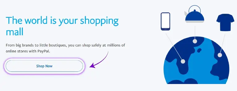
They have all rounded shape buttons. This just cements the fact that psychology plays an important role in conversion.
The below screenshot shows an example of a rounded CTA button.
Here are three important elements you must A/B test.
- Shape, size, and color of buttons:
- Color: Make sure your buttons are of contrasting colors with the overall landing page. See the example below. The primary color of the page is blue. However, the main button is highlighted in orange to make it pop.

- Shape: Sharp button tends to convert lower than the rounded one. One reason might be that we are naturally wary of sharp things. But better to test it out.
- Size: Size also plays an important role in conversion. However, bigger is better!
7. Use Social Proof Effectively
In the online world, social proof is everything! But what exactly is social proof?
Simply put, it's a confirmation by the users of your products that they liked them. One example of social proof is online reviews.
Headspace, a meditation brand, successfully demonstrates the use of social proof.

Notice the three points. The first says 4.9-star rating across 600k ratings. The last one tells the current members, i.e., 70 million. Now, this makes users think that 70 million people are using it with 4.9 stars, then it might provide something good, something unique.
They didn't stop here. See the image below.

They have carefully chosen customer testimonials that talk about the common pain point of people. The common theme of this testimonial is 'stressed,' 'loneliness,' and 'broken.'
To add more punch, these testimonials also highlight how Headspace helped them. A win-win situation.
Here are a few tips to include social proof effectively and raise your conversions
- Include Social Proof Strategically. These means do not include any general reviews. Instead, use reviews where customers talk about their pain point and how you helped with it.
Take a look at the below screenshot showing how it can be used on a landing page.
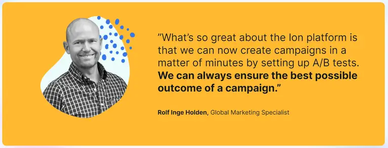
- Personalize Them. Simply using the text won't do the job. Personalize it by using the customer's name, photo, link to their social media, etc.
- Don't Just Go By Design. Traditionally, social proofs are put at the bottom of the page. But it's more beneficial to leverage these testimonials when the user is at a point of friction or near the call to action button to help them cement their decision.
8. Leverage Emotional Resonance
The emotional design turns casual users into fanatics, ready to tell others about their positive experiences. – Aarron Walter
We think we make every decision logically. But, the fact is, we don't.
By looking at brain activity, researchers could predict 7-10 seconds what decision the person would make even before they are aware of their decision.
This shows that even when you think you are making a logical, conscious decision, you aren't aware that your mind has made the decision already. It was unconscious.
Here are a few tips to follow:
- When designing your landing page, look for a clue as to which emotional triggers resonate the most with your users. This goes hand in hand with the first impression. However, there is a clear difference between the two. The first impression is all about developing familiarity, whereas emotional resonance is to create a mood and draw the user deeper into the page.
Take a look at the below screenshot of Asana’s landing page with a case study showing how it could help the customers. So, this is an example of creating a first impression.

- Once you have picked the mood, only then should you move to colors, fonts, images, etc. Choosing these elements arbitrarily will only confuse your readers. For example, blue doesn't automatically equal trust, and red isn't always angry.
9. Make Them Want To Read More With Exceptional Copy
Okay, CTA, images, color, and logo matter. But are you forgetting something? The content copy on the page!
Once your user visits your page, their brain absorbs the visual info. Once it's done, and they decide you are trustworthy, the conscious mind kicks in and starts reading the copy.
Take a look at the below screenshot using simple yet effective copy to grab the audience's attention.
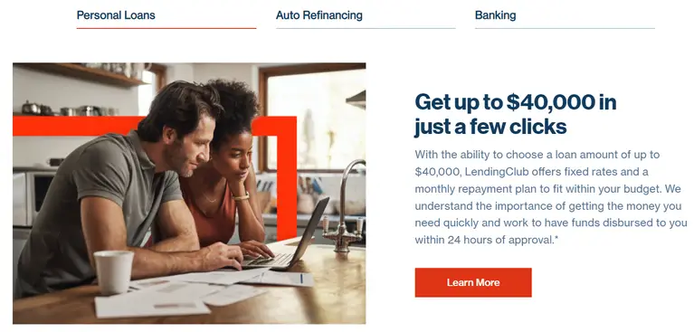
Here are a few tips to improve your copywriting:
- Be specific. We have the best car in the world. Our car earned the national safety award for the third time. Which claim is more believable? The second one, right? Specificity converts.
- It's not about YOU. It's about THEM. Like every human being, we love to talk about ourselves. You will fail if your landing page is all about you, your company, and your products, not their pain or problem.
Landing Page Optimization - FAQs
1. What Are A Few Elements Of A High Converting Landing Page?
Several things make a high-converting landing page. These include:
- Strong, bold headlines and CTA.
- Powerful copywriting.
- Choosing high-quality images that complement the overall landing page look.
- Strong offer
- Consistent flow
2. What Makes A Successful Landing Page?
A successful landing page contains a strong offer and a convincing reason for how users can benefit from the said offer.
3. What Are All The Types Of Landing Pages?
There are different types of landing pages. These includes
- Splash page
- Thank you page
- Lead capture page
- Sales landing page
- Squeeze landing page
Key Takeaways
- Understand your target market.
- Make your copy exceptional.
- Conduct regular A/B tests.
- Leverage emotional resonance.
- Isolate your users to reduce distractions.
- Use social proof and trust badges to improve trust.
ABOUT THE AUTHOR:
Brice Decker

Brice has been handling marketing projects for more than 12 years and he is providing consulting services on SEO, Social Media and PPC. He has a huge expertise in working at large corporations including Accenture Interactive & PwC Digital Services.
ABOUT THE AUTHOR:
Brice Decker

Brice has been handling marketing projects for more than 12 years and he is providing consulting services on SEO, Social Media and PPC. He has a huge expertise in working at large corporations including Accenture Interactive & PwC Digital Services.
Related Post
How to Rebrand Your Business Without Losing SEO?